Thursday, 22 November 2012

Graphics: Evaluation

Oscar Wilson
  EVALUATION

Oscar Wilson

He is a calligram artist who is know for making objects out of words. To create my own oscar wilson t-shirt design i started to sketching a silhouette design related to surfing then fitted it with surfing words that linked to the surf project, once i was happy with how the words filled into my silhouette design i then went over it in a black liner and rubbed out the pencil outline of the design, i scanned my calligram into photoshop and cleaned it up a bit and then added colour into the section which i wanted.


The difference between mine and oscar wilson's work is that his work is obviously more accurately to the shape and his design and he's words fills the shape and more of his design. Whereas to my work the words are quite squareish and i still have some gaps within my words, i wasn't able to make this really look like a palm tree.

Oscar Wilson uses within his calligram random words that has no meaning but still links to the image, which i applied t my work by using surfing words such as: Beach, Dude, Bonzer, Awesome and more. I find his work really unique and creative being able to create an image out of words in such a bold and striking way.
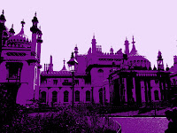


Graphics: Photoshop T-Shirt Stencils & Chris Ede

Photoshop Three Colour Stencils: Using brighton picture in photoshop we duplicated the layers. With one layer we then had to go to "Image" ➔ "Adjustments" ➔ "Levels" to add so contrast into your picture once done then we duplicated that layer so we ended up with 3 layers. By hiding the top layer then going to the image that we just contrasted a bit we then "Image" ➔ "Adjustments" ➔ "Threshold" making it quite dark as it would used for the bottom layer so it needs to be of colour. Next we have to delete the white going to "Select" ➔ " Colour Range" then click onto the white sections which now makes the white become selected then by pressing deselect we were now able to see it a bit underneath. Then to change the colour by going to "Image" ➔ "Adjustments" ➔ "Hue and Saturation" ticking the colourise box and changing the colour to your liking. Then going back to the other layer at the top repeating "Image" ➔ "Adjustments" ➔ "Threshold" but this time making the threshold lighter then going to "Select" ➔ " Colour Range" then click onto the white sections which now makes the white become selected then by pressing deselect then make a new layer then put the new layer underneath both of the pictures that you have worked on and either fill the new layer with white or another colour so then you have your three colour stencil.


Materials: Photographs, Adobe Photoshop, Layers, Select 'Colour Range' Function, Hue/Saturation, Threshold Function, Delete Function.

Techniques: Creating a stencil style image using a photograph and Adobe Photoshop

Equipment: Mac Computer, Adobe Photoshop

Graphics: Lin Osbourne T-Shirt


Lin Osbourne Style: By Using Photoshop and our pictures from brighton which relate to the project theme surfing, once we decided on our pictures and creating a new custom document we dragged them into photoshop and then cropped the pictures by selecting the "Crop Tool" and holding down shift was able to make a  perfect square so they would be the same size. Then going back to your custom document then drag each of your finished cropped pictures into the new document. All the pictures won't be the same size so by pressing "Cmd" & ' a grid  would help us arrange them so they are the same size. Afterwards, you place then however you would like i decided to incorporated my final logo onto the top.

Materials: Photographs, Adobe Photoshop, Layers, Crop tool, Hue/Saturation Function

Techniques: Creating a photocollage T-shirt inspired by Lin Osbourne's Photocollage's

Equipment: Mac Computer, Adobe Photoshop, Photographs 


Graphics: Si Scott T-shirt

Hand Drawn Si Scott Style


Illustrator Si Scott Style: Firstly typing some surfing related text in bold font, then clicking onto the selection mouse and right clicking onto the text then selecting "Creating Outlines" which separates all the letters so you are able to space them out.  By going to my selection panel i then selected the "Warp Tool" to click and drag the words out a bit so that when i go swirl the words you will still be able to clear l see the words. Then using the "Twirl Tool" which allowed me to create the swirls.

Materials: Adobe Illustrator, Text Tool, Warp Tool, Paint Bucket

Techniques: Warping The text to give a 'Swirl Effect'

Equipment: Mac Computer + Adobe Illustrator 


Monday, 19 November 2012

Graphics: Oscar Wilson Calligram T-shirt Logo Print


Calligram T- Shirt Logo: To make our own Calligram T-shirt Logo print in the style of Oscar Wilson we began by tracing a picture that was related to surfing, traced the outline out in pencil. Once we finished doing that we then started to fill the inside with surfing words for example: Sand, waves etc. following the outline of the shape when it was all filled we went over it in a black fine liner scanned it into the print and began to work on it in photoshop. Just like before we had to clean up our picture in photoshop.


Adobe Illustrator: Then moved it into Adobe illustrator and live traced the picture as e have done before with the other logos. Afterwards we added colour inside the words or we could of just added it to the outline of the words to make it more interesting. Sometime i would find that i had some gaps within my words so it would fill the word and the outside of the design so i had to take it back to photoshop to add some extra lines to close up the gaps that i had. 


           T- Shirt: When i was happy with my logo print and the colours i presented it onto a t-shirt. I really liked my final calligram logo print. 


Materials: Hand drawn calligram, Pencil, Cartridge paper, Tracing paper, Fine liner, Adobe photoshop, Layers, Text Tool, Colour range function, Paint bucket

Techniques: Creating a hand drawn calligram, Scan it in, Clean it up on photoshop and live trace it on adobe illustrator to colour

Equipment: Mac Computer, Adobe photoshop, Pencil, Cartridge Paper, Fine Liner

Graphics: Surfing Silhouette T-shirt


Outline: When making the surfing silhouette t-shirt we started off by drawing up a outline of our own surfing related silhouettes, once that was done we watched the tutorial to make a background texture which would be in the outline of the silhouette. 
The Texture: By using photoshop i used one of pictures from brighton by making the white bits of the picture into different colours by playing around with the hue and saturation. We also added surfing text changing the colour of that as well until we were happy with our design. Personally I found this tutorial hard and quite tricky but once i had some help i was able to understand it and to create another one. 


Texture and outline Together:  Before i decided to join both my outline drawing and the texture i had to scan the outline into the computer and cleaned it up in photoshop i also didn't like a particular part of my outline so i decided to remove it by using the magnetic lasso tool to just select the part of the outline which i wanted. By going to 'Colour Range and selecting the inside of my outline drawing i then pasted the texture into my outline drawing, moving around the texture behind to my liking merging the layers together. Once i liked my final outcome i presented it onto a t-shirt to see what it would look like. 

Materials: Abode Photoshop, Layers, Text Tool, Colour Range Function, Paint Bucket

Techniques: Creating a textural image using a photograph
 edited to change the colour and add text, then copying and pasting into a hand drawn silhouette of a surfer

Equipment: Mac Computer, Abode photoshop, Pencil, Cartridge Paper, Fine Liner


Friday, 12 October 2012

Graphics: Mindmap


The surfing project mind map was seperated into four sections: Surf related words, Names, Possible target audience & Existing surf brands we worked in groups to gather some information to put onto the mind map. We designed the mind map with little illustratsions connected to surfing and to make it more colourful.

Monday, 8 October 2012

Graphics: Initial Logo Drawings


For the initial logo drawings we had to come up with both calligram and other clever logos we had to create 8 logos but i wasn't about to come up with that many. It was difficult making some of these logos likely i was able to gain sue inspiration from my quick icon sketches however with others i thought of things/objects which are related to surfing but also fitted in with my target audience, Kids.

Graphics:Quick Icon Drawings


With these quick icon drawings we had about 5 seconds to quickly draw a little icon to relate to the surf related words.

Friday, 5 October 2012

Graphics: Final Logo & Questions


  • Are you happy with your final logo? What works well?

I'm happy that I decided for my final logo to go for a calligram. I think it worked really well with the name 'Little Waves' as I created a wave with the letters.

  • Do you think you could do anything to improve on this? You must write at least one comment here but more would be good!

Improvements 
- Maybe adding a bit of colour in the white gaps. 
- To make the words a bit more clear for example the 'Little' the T's look like E's.
- To make the lines more straight.  

  • Was there any logo that inspired your design? It would be good here if there was and you showed it on your blog

There wasn't a specific logo that inspired my design however I was inspired by the shapes of waves and thought of how it could be in-coperated into my logo name.

Graphics: First Logo


My first logo that I designed and edited on Photoshop once I finished editing it on Photoshop I then used Illustrator and made my logo come alive and more appealing for my target audience.